Pantone Formula Guides & The Pantone Matching System

THE PANTONE® MATCHING SYSTEM
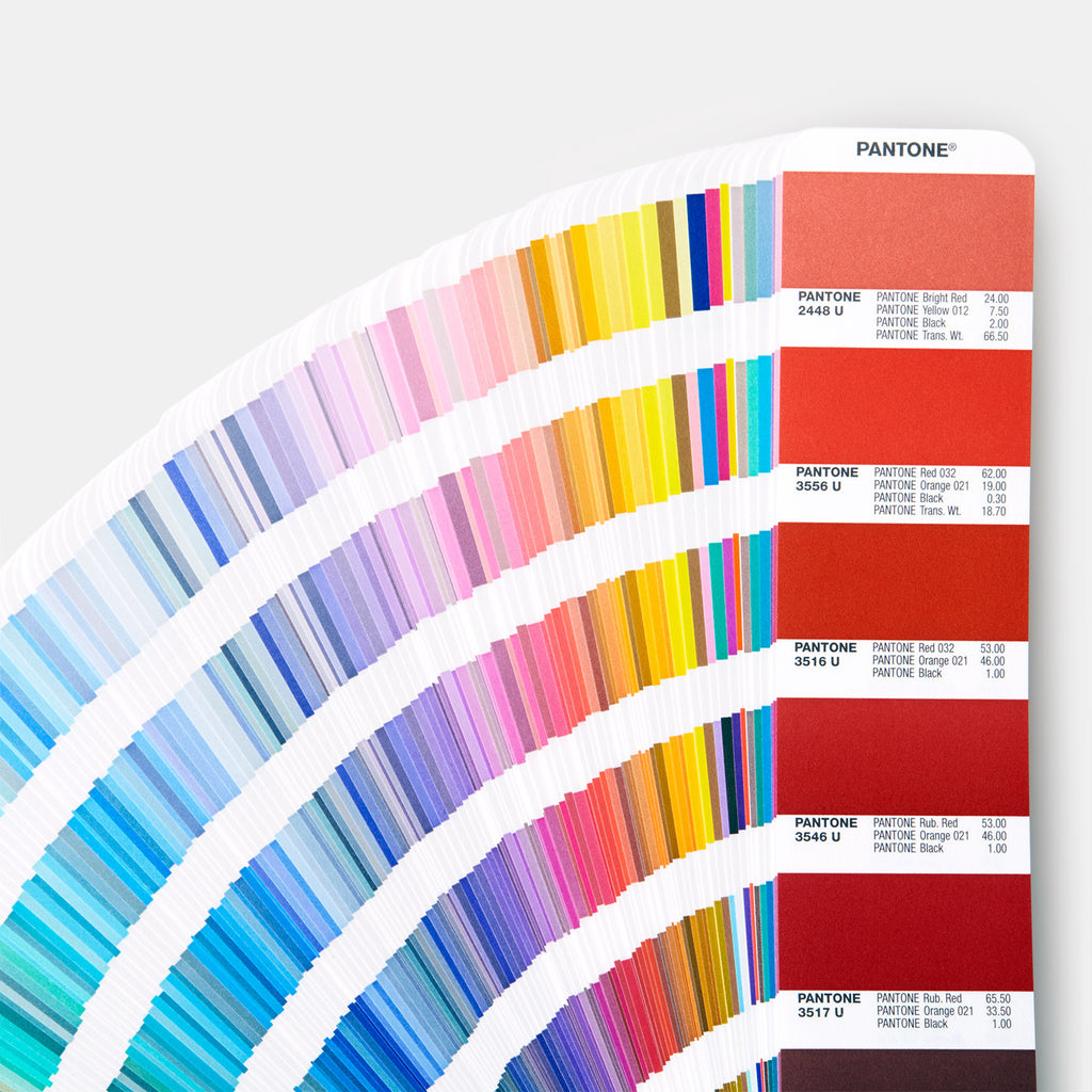
The PANTONE Matching System (PMS) is the best known ink colour mixing system in the world today. It was designed to provide colour standardisation for the entire printing industry. It also provided an array of colours to graphic designers. The printer was able to reproduce these colours by mixing together two or more standard basic colours.
When the first PANTONE Colour Formula Guide first came out, there were 10 standard basic colours. With these 10 basic colours, you could mix any one of 487 different colours, not including metallic golds and silver or the 42 fluorescent colours.
Each formula was printed in “parts” only. All formulas were 3 digit numbers. By following the formula provided, you could mix any colour very accurately. In the mid-1970s, Pantone added the “gram” or percentage formulas to the guide as well as the “parts”.
In the mid-1980s; Pantone introduced an up-dated PANTONE Colour Formula Guide 747XR. The number of colours available increased from 487 to 747. In that book,4 digit numbers were added, an additional basic colour was added, PANTONE Violet, and 4 basic “0” series colours; PANTONE Yellow 012, PANTONE Orange 021,PANTONE Red 032, PANTONE Blue 072 were added. The number of fluorescent colours dropped to 7 instead of the original 42.

In 1991 Pantone introduced still another up-dated PANTONE Colour Formula Guide, the PANTONE Colour Formula Guide 1000.This new book contained over 1000 colours, including all the old numbered colours from the 747XR series book. The fluorescent colours were increased from 7 to 14.
The most recent books are the Pantone Plus Series which contain 1341 colours.
Do not use old PANTONE Colour Formula Guides to judge colour reproduction. Purchase a new one at least once a year so that you can be sure that the colour in your present book is accurate and has not faded from exposure to light.
Weighing and Mixing it
As the demand for colour printing increases, the demand for short run black and white printing shrinks. Many of the smaller print shops have had to look into new printing markets. Most are looking toward the short run colour and coated stock markets.
These markets create a new challenge for the small printer; keeping costs down, yet providing the customer with a wide range of colours. Many of these printers have turned to the PANTONE Matching System® to give the customer the largest selection of Pantone process ink colours available.
The PANTONE Matching System requires the printer to have certain material for the system, such as ink, ink scales, ink knives, empty cans, and a formula guide. All of these things can be purchased separately. There are several methods of mixing ink by hand. Alternatively they can be ready mixed by your litho ink supplies company.
When colours fail to match
A colour selected from a colour card or the PANTONE® Formula Guide may not print exactly the way you expect. There are many factors involved that determine the shade of the printed colour. In most situations the colour will print the way you want it to appear. When it doesn’t, there are a few tests you can use to determine where the problem lies.
Colour of stock
The colour of the stock will affect all inks to some degree. Transparent inks are greatly affected by allowing the stock colour to show through the ink film. Colour inks that are to be printed on colour stocks should be colour-matched on the actual stock being used. Proofing the job on the actual stock to be used is recommended before going to press.
Paper absorbency
Paper absorbency is another big factor in printing with transparent inks. Ink is formulated to print a given colour by using a normal ink layer on the printed surface. If the paper is very absorbent, it will require more ink to cover the surface, especially if the surface is not smooth. When a heavier ink film is printed, the transparent ink colour will be deeper and more intense. Again, proofing the job on the actual stock to be used is recommended before going to press.
Light source
Pantone colour inks, when printed, can be affected by the light source used to view the printed sheet. Be sure to compare the printed colour and the original colour swatch under the same light source.
Searching for Pantone Colour guides?
We stock a full range of Pantone colour books for any design project. New arrivals include the Coated & Uncoated Pantone Formula Guide, the Pastels & Neons Colour Guide, the Skintone Colour Guide (for fashion magazine projects), and the Metallics Colour Guide Set.
Need Pantone Process Ink or any Litho Print Supplies?
We supply a full range of Print Consumables, including Standard Pantone Ink, Pantone Matching Guides, Litho Print Chemistry, Litho Printing Blankets and OverPrint Varnishes.
- Clive Harper


