Why and When to Update Your Pantone Guides & Books
UPDATING YOUR PANTONE GUIDES CAN SAVE YOU VALUABLE PRODUCTION TIME AND MONEY!
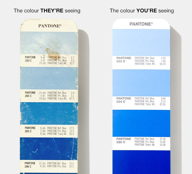
If you haven’t updated your Pantone Colour Guides and Chip Books for several years, you are likely to be viewing faded, yellowed, or otherwise inaccurate colour, meaning the colour that you’re looking at isn’t necessarily the same as what your customers are seeing – or the same as what will be produced. This can lead to a lot of extra rework, time, and money.
When you, your supply chain partners are making colour critical decisions – like reviewing press proofs or production samples – working from up-to-date guides and chip books can avoid a lot of headaches, such as:
- Miscommunication
- Multiple rounds of re-sampling
- Freight costs for re-shipping physical proofs
- On-press validation time
HERE ARE SOME REASONS WHY:
Ageing and Usage Effects: Is My Colour Still Accurate?
Pantone Guides and Books are produced and measured against high manufacturing standards. With each publication, you can appreciate:
- Highly-regulated ink formula consistency and overall printed quality
- During production, we sample each print run once every 200 sheets aiming at a CIEDE2000 of 2.0 or less, with an attainment rate of 96% in 2018
- Printed on popular commercial-grade 100 lb. and 80 lb. text weight paper stocks
- Colours visually and digitally aligned to the 2010 Pantone Master Standards
Despite all of this, no printed product can last forever. The colours in your Pantone Guide or Chip Book may appear inaccurate over time as a result of handling, fading, improper storage, and light exposure, among other factors. This is why we recommend replacing your guides every 12-18 months, depending on your usage case and storage habits.
- Handling = smearing and removing pigment from natural oils on fingertips
- Pages rubbing together = scratching or removing pigment
- Light exposure = fading
- Paper ageing = yellowing effects
- Ambient moisture = accelerated paper ageing
- Natural pigment expiration = faster, noticeable colour variation, especially in lighter and pastel colours
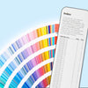
ARE YOU SHORT ON COLOUR?
Since we launched the Pantone Plus Series back in 2010, there have been three colour collection additions. Check out the chart below – you could be missing over 750 colours!

Missing colours could mean lost time locating the colours that your clients and brands might be asking for that should be right at your fingertips. Also, remember that the colours we add are often derived from trend forecasting and market demand, which means keeping up with what’s relevant and important in today’s world.
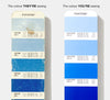
PRODUCTION GUIDES: IS MY VENDOR LOOKING AT THE SAME COLOUR?
As shown above, if your guide is new but your printer’s guide is even just a few years older, then your colours may no longer accurately match, which can cause unnecessary frustration, costs, and delays. Encouraging your manufacturing and supply chain partners to also keep their guides up to date can help mitigate this situation. However, this is often easier said than done, and knowing this, Pantone recommends that you always accompany your artwork and design files with a physical representation of your desired colour as the precise colour intent to strive for on-press.
Our Solid Chips and On-Demand Prints are designed to help you easily communicate your desired colours, as they illustrate Pantone Matching System® (PMS) Spot Colours in perforated or sticker formats that can be sent to vendors with design specifications.
- Clive Harper